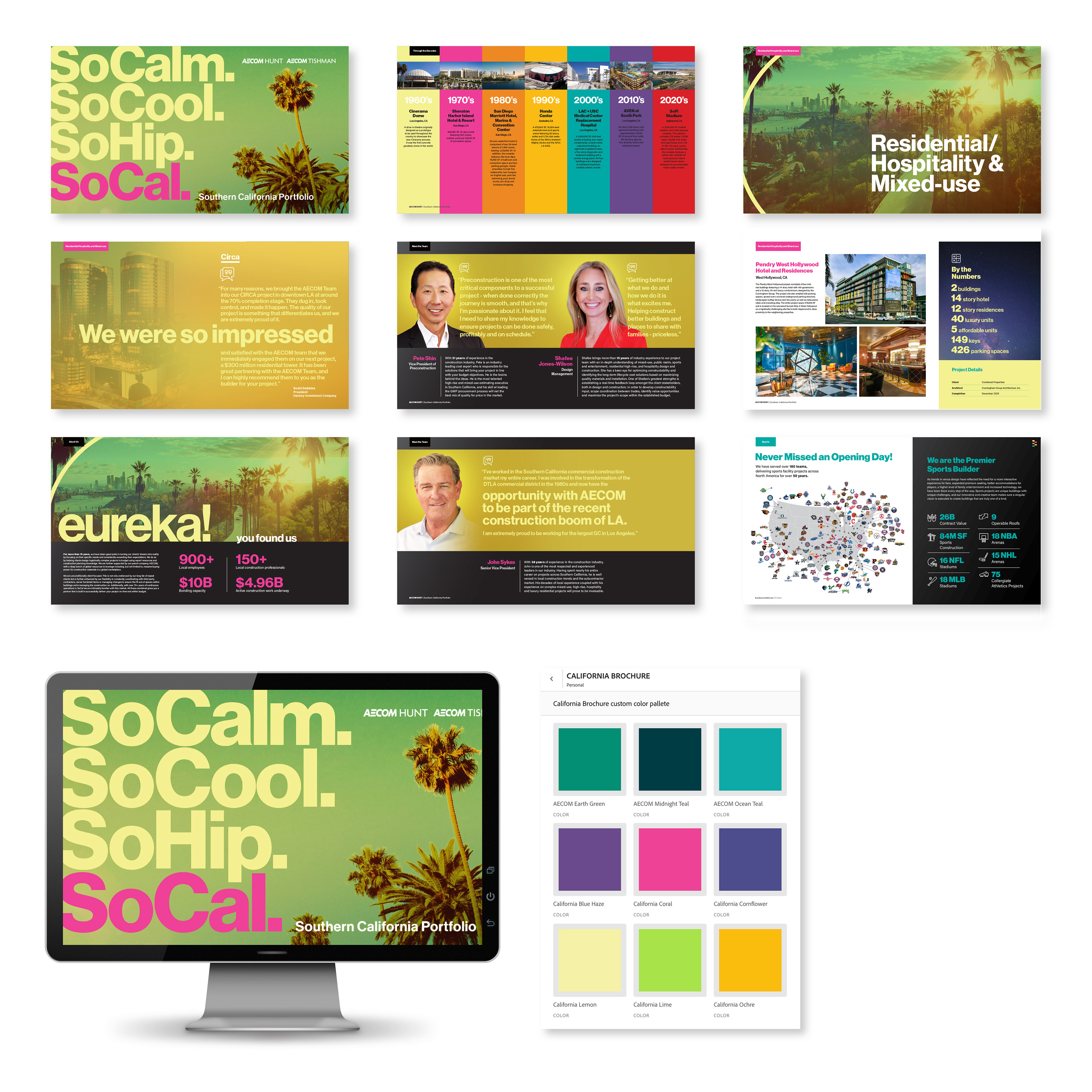
Case Study #1: AECOM Southern California Portfolio
AECOM’s existing Southern California Portfolio needed a refresh—their impressive portfolio of luxury hotels, streaming and AI studios, and venerable universities deserved a presentation that matched the work’s caliber. The challenge: craft a brand voice that resonated with contemporary architecture and Southern California’s creative landscape.
I created a solution centered on a single idea: “So Hip. So Cool. SoCal.” This tagline positioned AECOM within the region’s cultural energy. I developed a vibrant custom color palette that moved beyond corporate standards, reinforcing professionalism while capturing the creative spirit. Interactive elements and animation transformed static pages into an experiential journey—every motion and design choice telling the story of intentional, culture-aware design.
The result: a brochure that showcases not just buildings, but a design philosophy.
view the full interactive portfolio

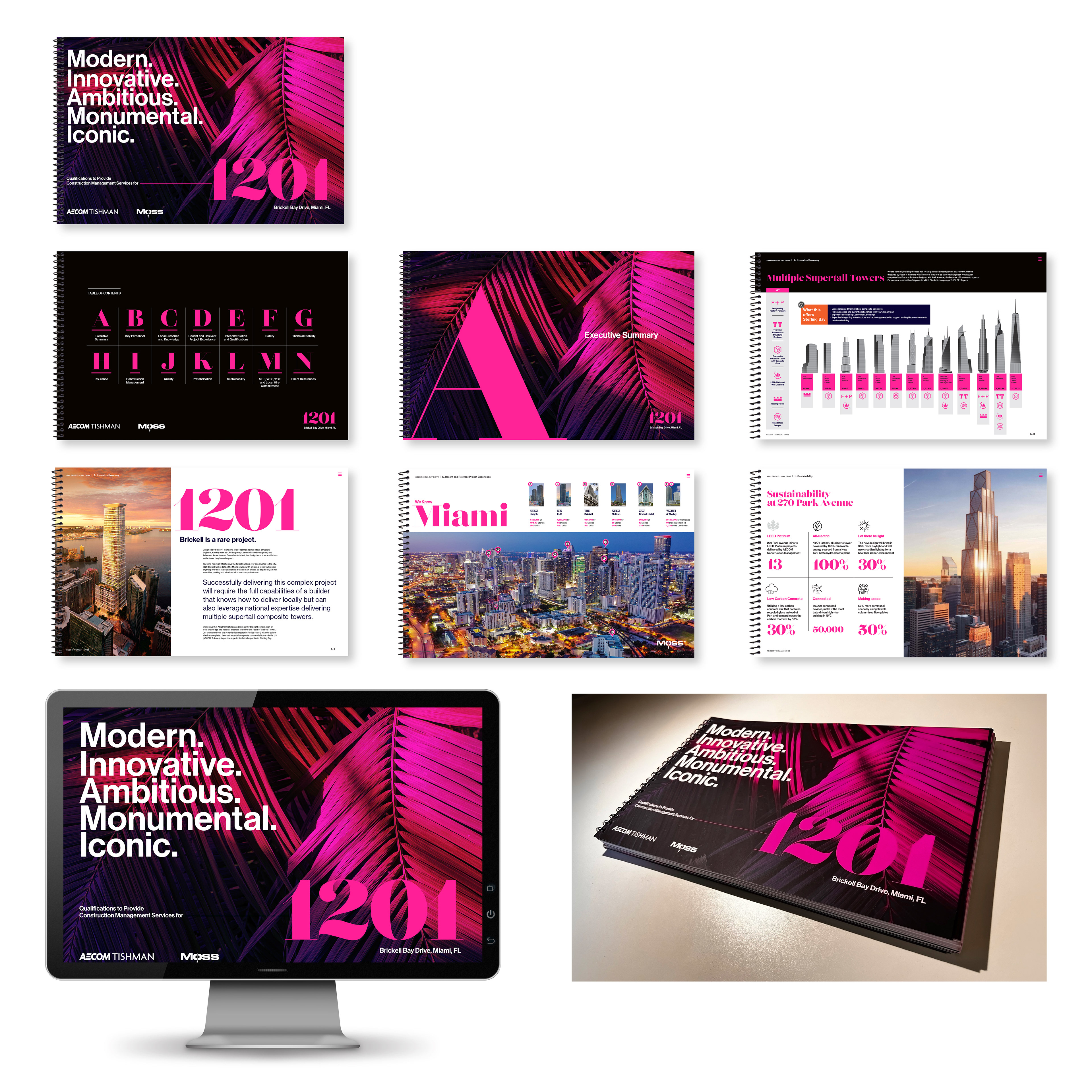
Case Study #2: 1201 Brickell
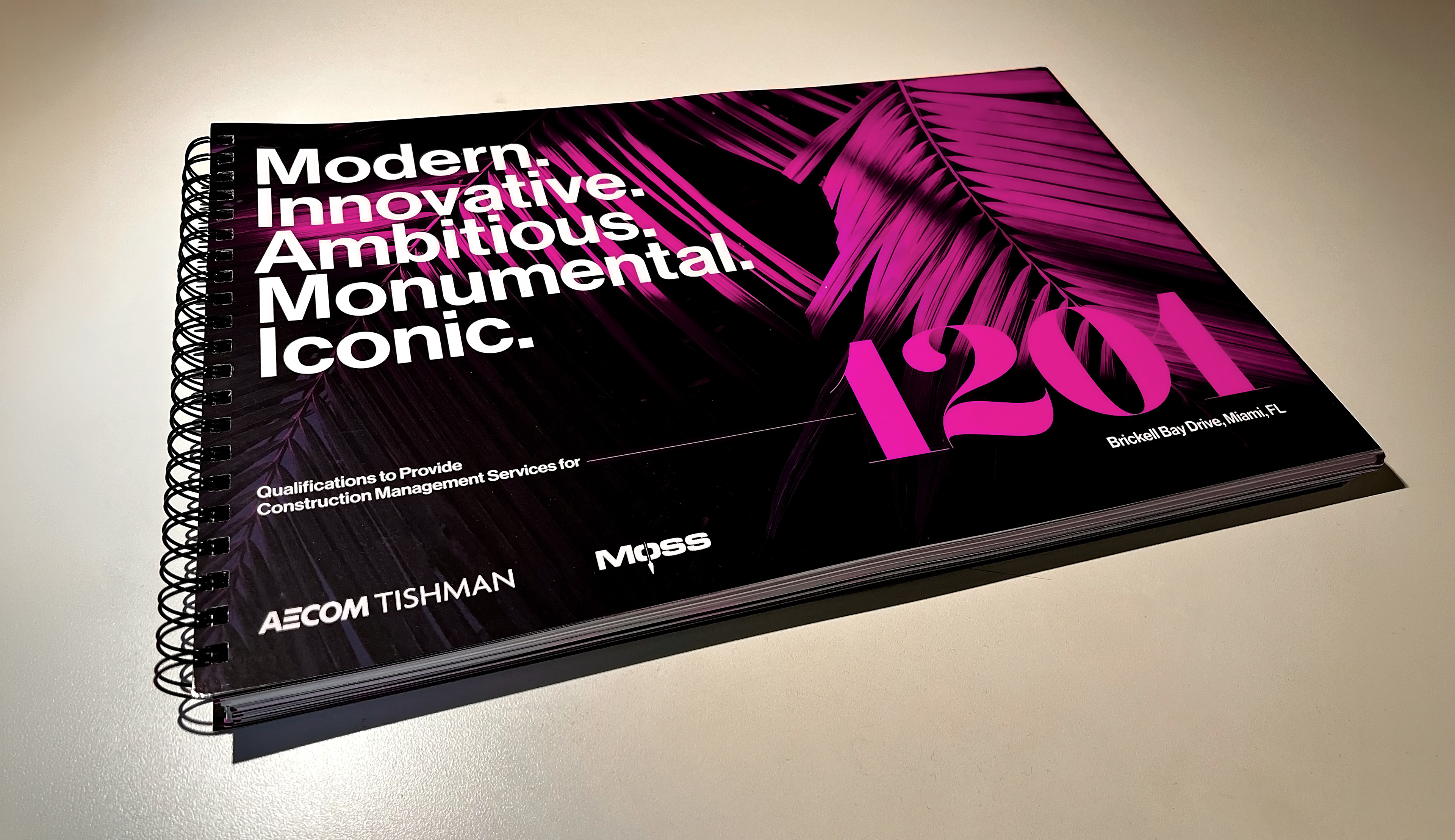
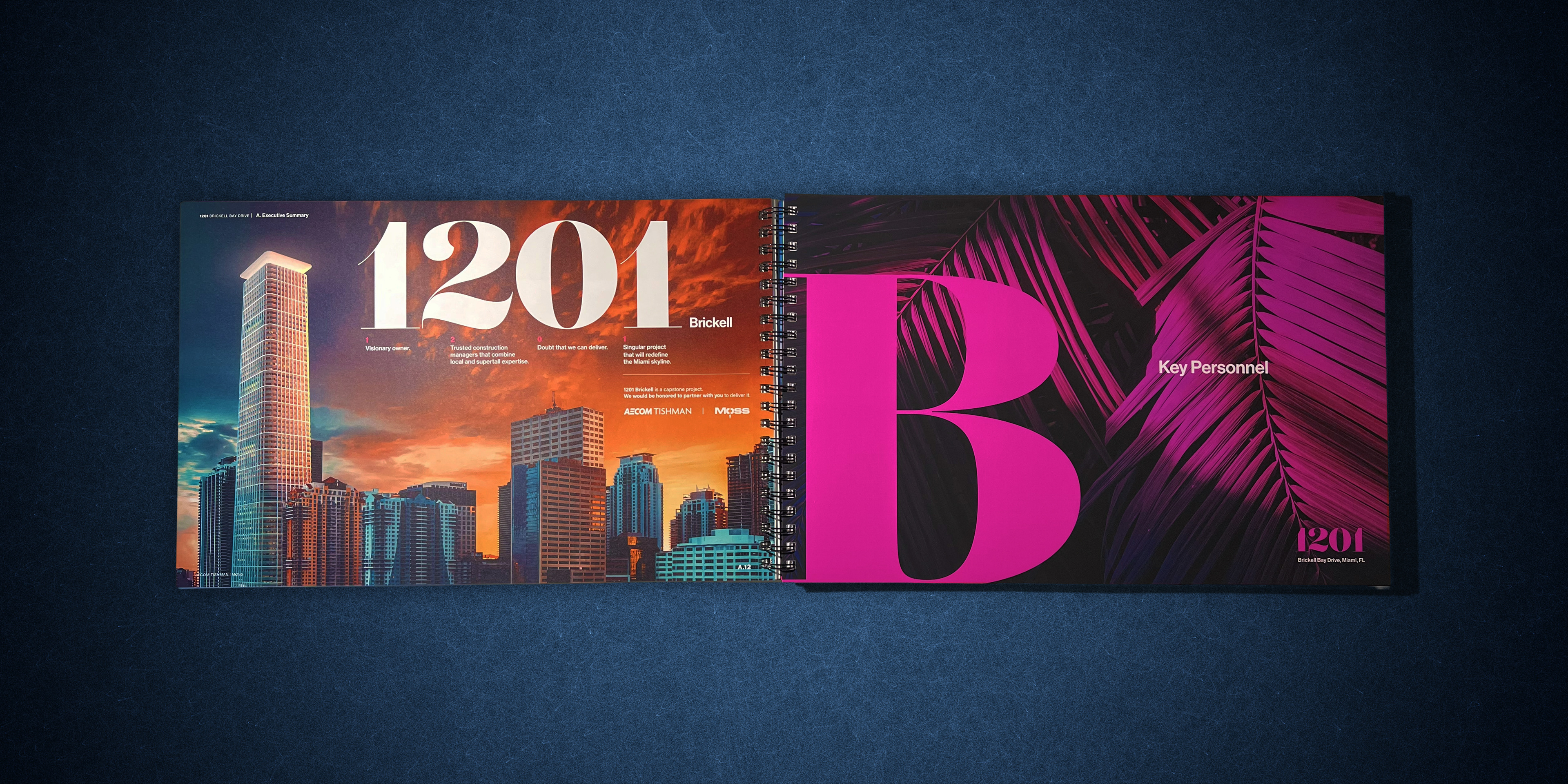
AECOM Tishman was tasked with landing the construction management contract for Miami’s first steel-frame high-rise on Brickell Bay Drive. Every iconic tower in Miami’s skyline had been built with concrete, the regional standard. The challenge: convincing stakeholders that AECOM, known for Manhattan steel engineering, could successfully pioneer this structural shift in Miami’s market.
The solution leveraged our proven track record. I developed a sleek color and typography identity that reflected Miami’s high-end cultural flair, encapsulated through the acronym ‘MIAMI’: Modern, Innovative, Ambitious, Monumental, Iconic. Every design element positioned AECOM as the firm bridging two cities’ architectural legacies — drawing on our expertise from One Vanderbilt, One World Trade Center, and Hudson Yards to establish credibility in a new market.
The result: AECOM is currently one of three submission finalists. When Miami is ready to build, we’re ready to lead.
view the full interactive pitch deck
The result: AECOM is currently one of three submission finalists. When Miami is ready to build, we’re ready to lead.
view the full interactive pitch deck

Case Study #3: Belmont Park
AECOM Tishman set out to secure the construction management contract for a $455 million redevelopment of an iconic yet antiquated racetrack. The challenge wasn’t just how to build it, it was how to convince stakeholders that a historic but weathered facility could be reimagined as a cutting-edge 21st-century entertainment venue.
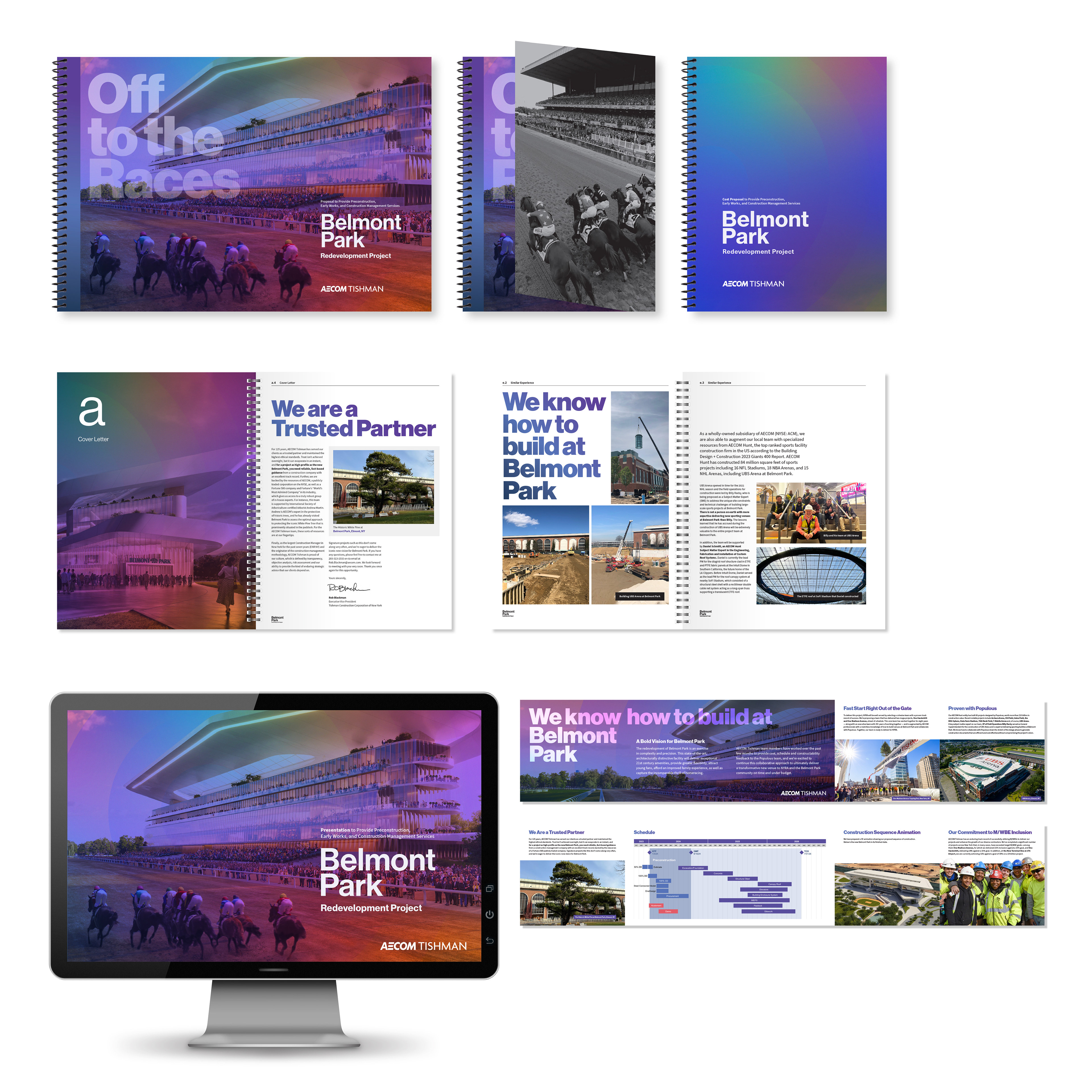
The solution required design materials to do more than present plans; they had to embody the transformation itself. I developed a refined visual language: a clean, modern color palette and typography that signaled the shift from outdated grandstand to contemporary entertainment destination. Every page of the pitch book, presentation deck, and leave-behind materials reinforced that same vision: a state-of-the-art entertainment complex reimagined from the ground up.
The result: we won the project. My visionary design positioned AECOM Tishman as the firm that understood how to bridge established heritage with technical innovation.
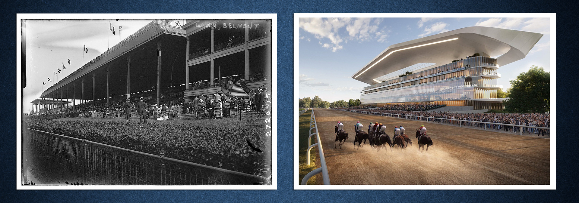
Belmont Park: 2016 vs. 2026
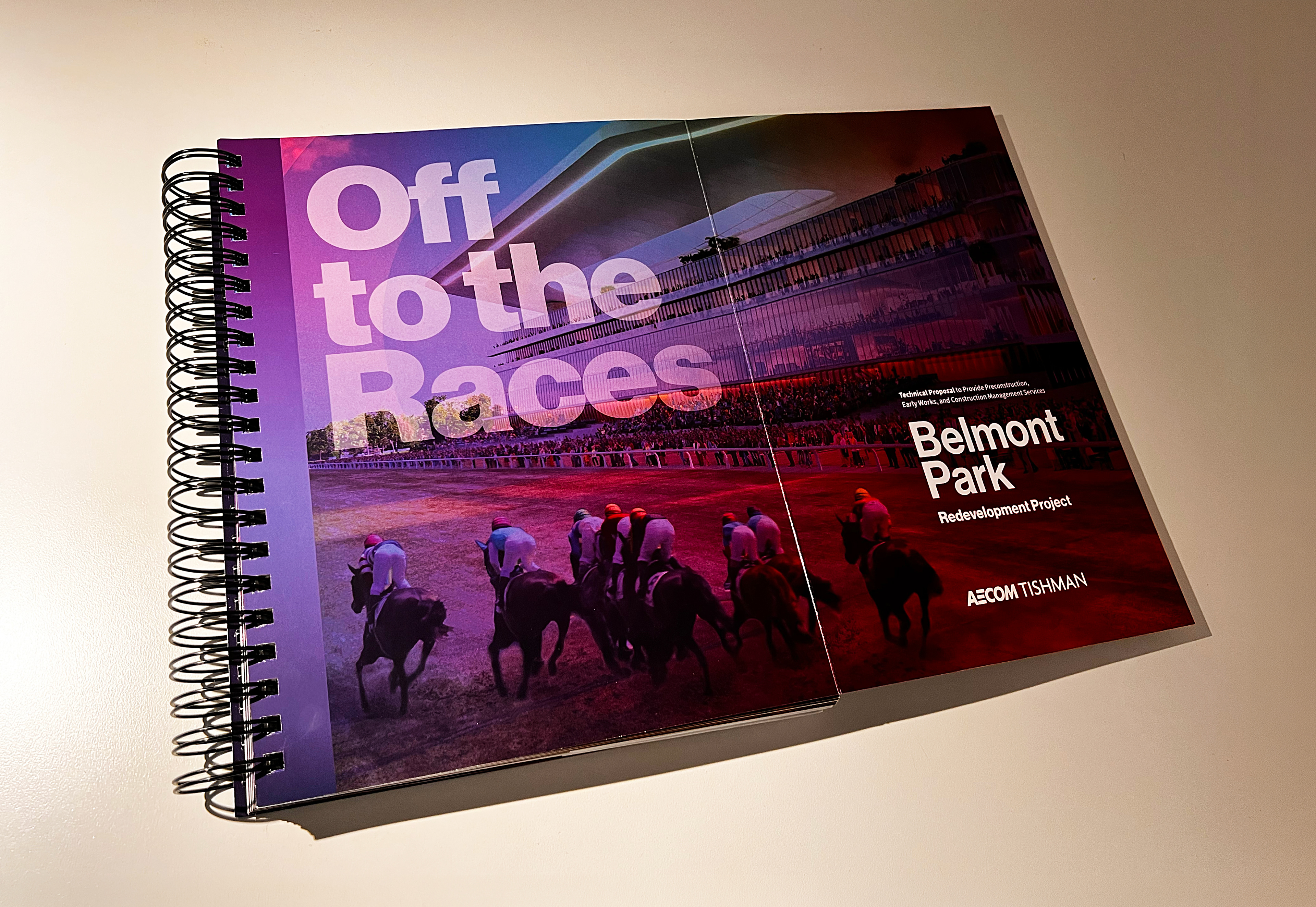
Belmont Park proposal unfolded (open)
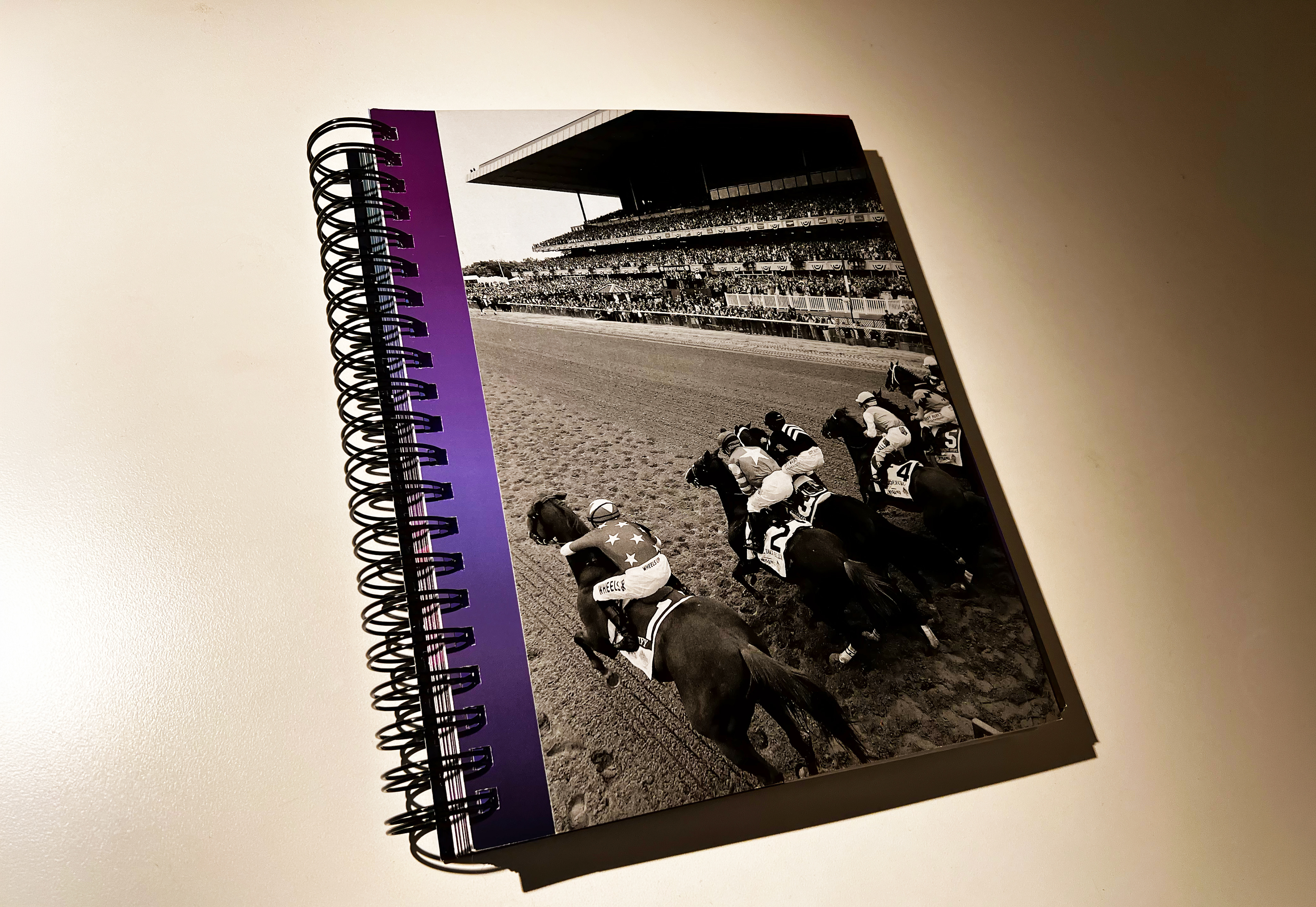
Belmont Park proposal folded (closed)
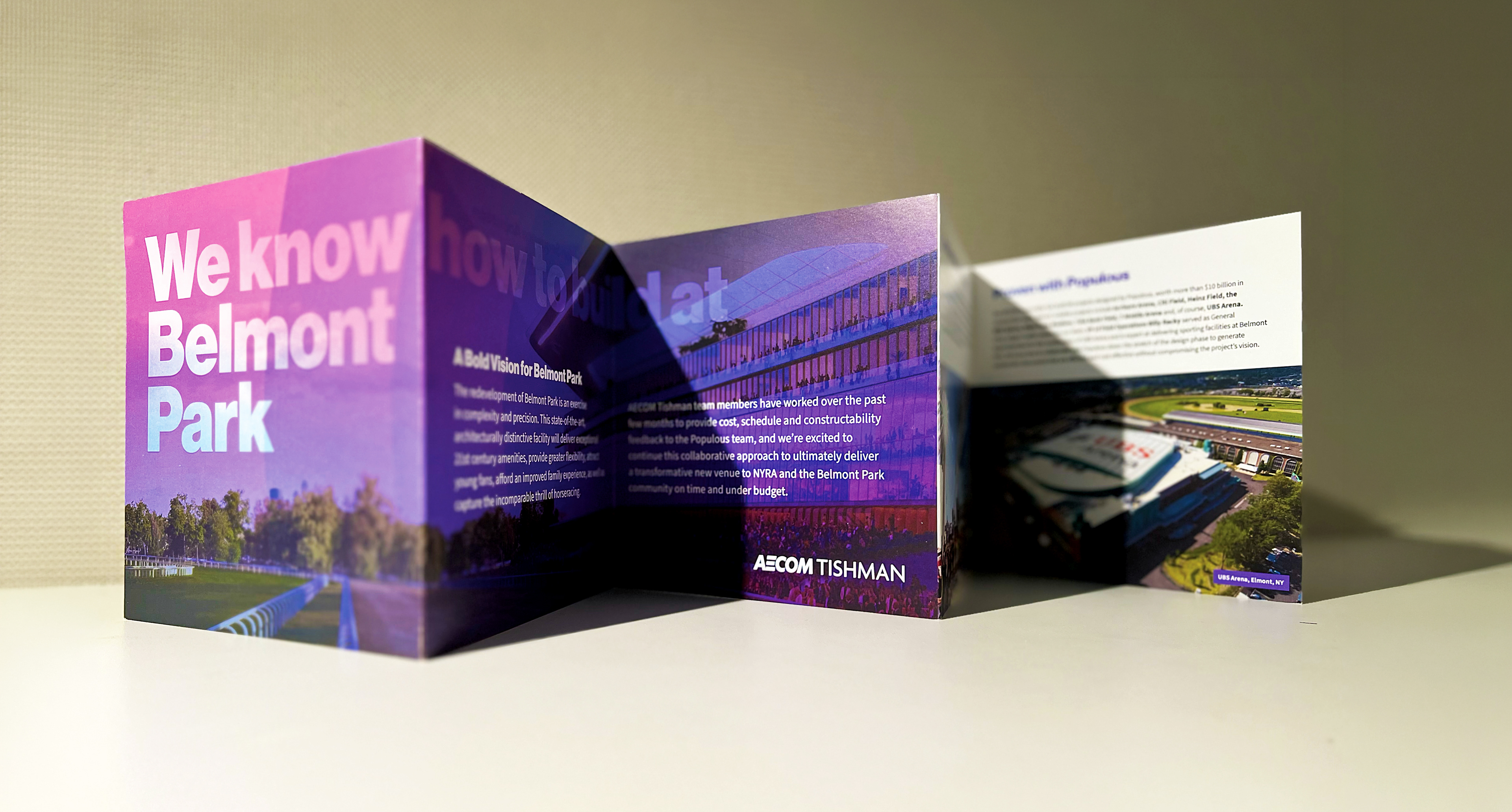

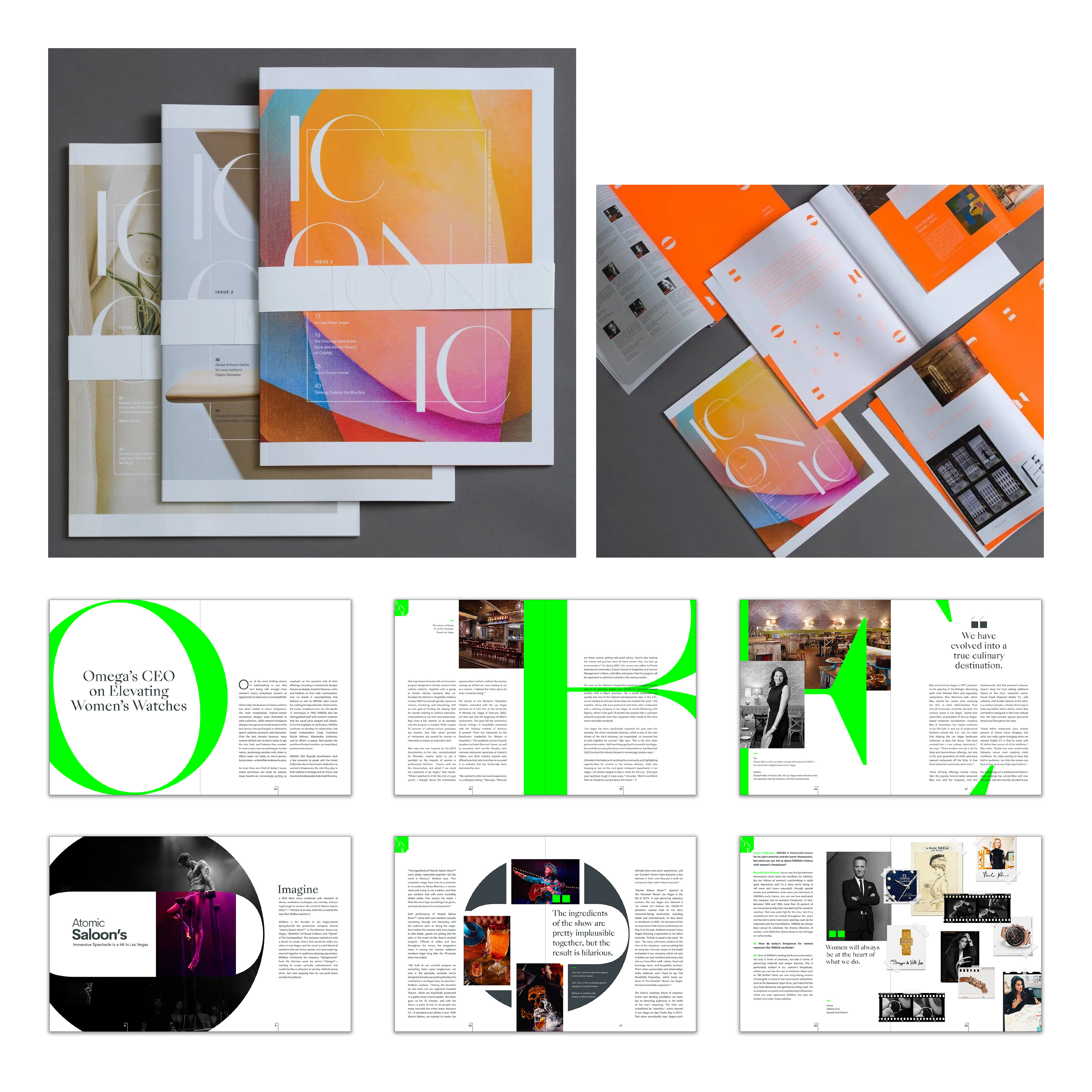
Case Study #4: ICONIC for Brookfield Properties
Brookfield Properties wanted to transform their basic trade publication into an eye-catching cultural statement. The challenge: create B2B magazine that felt less like corporate collateral and more like a visionary, editorial style guide. That involved profiling the tastemakers and power players shaping the luxury real estate market in a slick, perfect bound copy and its digital counterpart.
Taking full creative ownership, I built ICONIC from concept to finished print object. The editorial direction centered on people who moved the needle in luxury and design so the profiles photography, typography, and layout had to mirror that level of sophistication. I introduced a neon spot color as a bold throughline, injecting energy and modernity into spreads without sacrificing elegance. Embossed logo, wraparound cover and varied paper stocks transformed each issue into a tactile experience readers entered before reading a word.
A companion microsite and digital ecosystem extended the brand beyond print, giving ICONIC a presence as considered online as it was on the page.
The result: a publication that established itself as the authoritative voice of the Brookfield luxury market. ICONIC was recognized at the 2022 Ozzie Awards with Honorable Mention for Best New Magazine Design and Best Microsite — validating the core ambition from the start.